Review: SAS S1-Aloha
background
In an early blog post I wrote about my thoughts, impressions, and experiences with the Search & State brand. You can read it here. Overall I've had great respect for what they are doing and the products they bring to market. So while everyone was and has been in a rush to get their floral print kit to market, SAS has held strong to their very minimal no graphics aesthetic... until now.
So why now? That's a question only they can answer, but I will say that it looks like they were just making sure they did it right. While I've smirked at too many floral prints to count, and been underwhelmed by even more, it was on the first site of the SAS S1-Aloha that I stopped to take notice. Something about it was just right. I didn't even realize it was from SAS so it was an honest genuine second take.

initial impressions
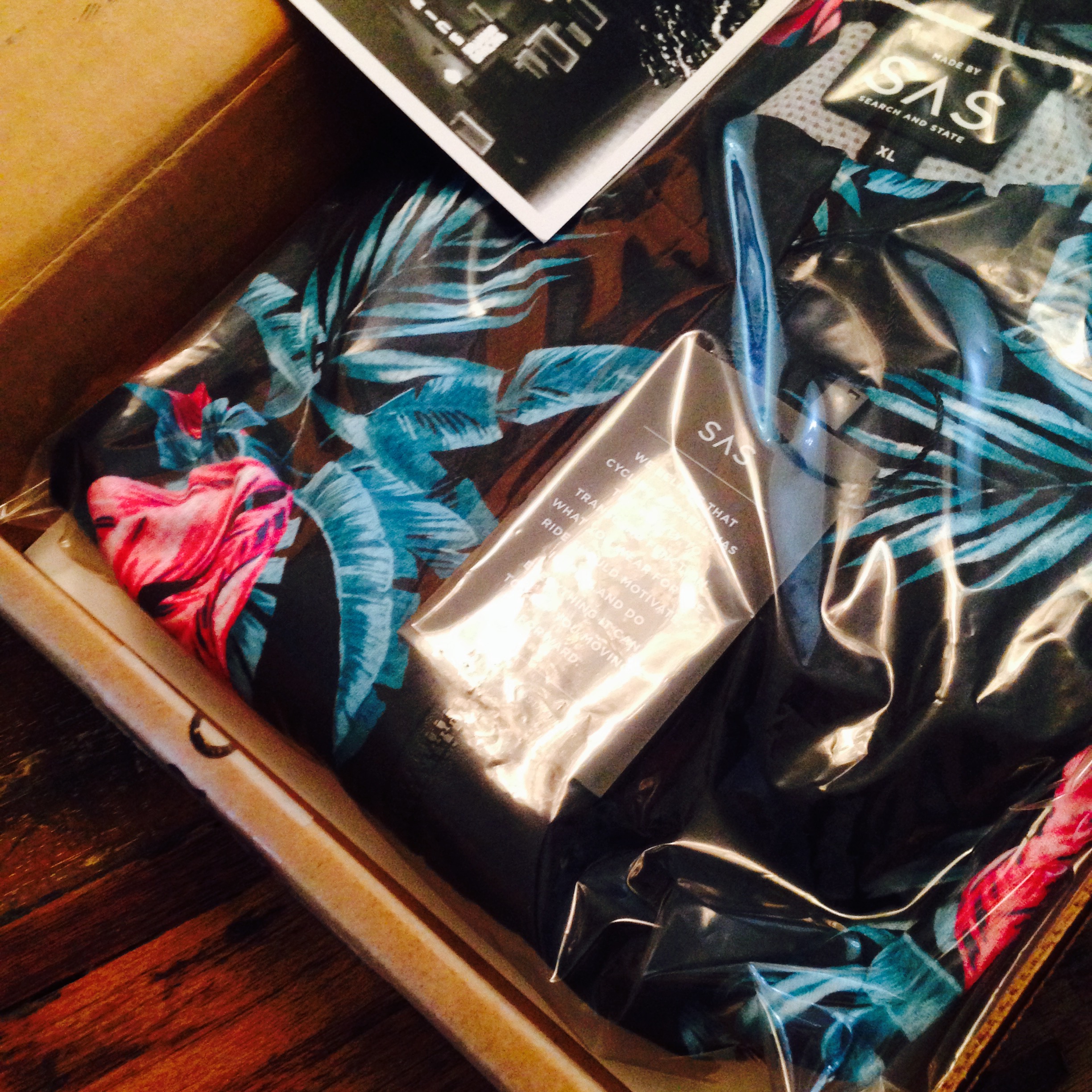
As always, the packaging and delivery of the SAS products is well done. Delivered in a well constructed plain cardboard box and with a stamped logo on the box, it's all business. It's well secured with very official looking SEARCH AND STATE packing tape. Details! It's all about the beautiful details.
First reaction was that the print looks even better in person. Bold colours and a clear print. Sliding the jersey on, it felt... different. How is that so? Well more on that in the sections below. What you need to know is that the jersey feels great and it gives the same sense of craftmanship you'd expect from SAS.
the fit

Here it is. Trying it on, the cut feels different. According to their sizing chart, my size hasn't changed and while it's part way into the season and I'm dropping weight, this jersey still feels a little more roomy than the original. Likely due to the lighter fabric. I'd call it the pro-am fit. It's not a full gut hugging race fit but it's not a baseball jersey inspired club fit but any means. The front is long enough to not ride up past the front of your bibs and the back is long enough but not too long that it will hang loosely all over the place. The sleeves are the more modern mid length which should help keep your tan lines crisp and consistent.

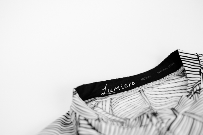
the print
It's definitely floral! It's an unmistakeable aloha vibe on a black background. Bright colours should have the added benefit of visibility to drivers on the road while eliciting waves from passers by. The jersey should also match well with any all black bibs you have. But what other colour bibs would you have?
branding
Branding minimalism is something that I've always been drawn to with SAS. Why? It's the lack of branding I'm after and the S1-Aloha keeps that in check. There is the expected brand patch on the back right pocket and on the left sleeve cuff. Inside there is a small label behind the zipper (only seen when your jersey is unzipped) and a logo label inside. That's it and it's all very subdued. The emphasis is where it should be. So if you want some style without being a rolling billboard then Search and State should be a serious consideration for you.
construction
Less but better. In overall design, the S1-Aloha has everything you'd expect and not much more. There is a full front zip and 3 room pockets in the back. Enough space for you to pack your food, tools, and roll up your S1-J for the ride while not feeling to bulky. Because of the length of the back matched to the size of the pockets, I find they are easy to get in and out of while riding. Thumbs up. The middle pocket is smaller than the sides and I do find it hard to find a packed tool pouch or rolled up jacket inside but it does get in there.
In a response to my earlier blog post, SAS contacted me to let me know that they had improved their textile to address the wear and tear tendency of the original textile. This means that the anxiety feeling of knowing your new jersey is going to get a snag on the first wear is now gone. Awesome to see evolution in practice. The fabric is now lighter in thickness and softer in feel which makes breathability a lot less concerning in warm weather.
The craftsmanship continues to be top shelf and the overall construction inspires confidence that you'l be friends with this jersey for a long time. Probably well after your sick of all things floral. The front zip is a Riri zipper (I prefer YYK for its smaller size but RiRi for its durability) and your chin is protected by a collar tab at the top. I really love those little details. The bottom hem has a healthy dose of silicone for grip to keep your jersey in place. This will also help people get a good awe of your awesome floral. Note that there is no silicone on the sleeve cuffs and they can ride up a touch.
bottom line

Search and State thank you card.
Part of being an early adopter is an understanding that many of the things you are trying are new, first runs, and not always perfect. While I did have a few reservations about the first run of S1-A jerseys, it was never enough to hold back a recommendation to anyone. Clearly Search and State have listened to their customers and made changes to the textiles while adding some personality into the line. When it comes to companies you should feel drawn to, these are qualities to look for. Besides, who else sends you a hand written thank you note? Thanks Devin!
At the end of the day I'm really happy with the S1-Aloha jersey from Search and State and it brought a big smile to my face when I put it on. Looking forward to the joy of many miles ahead.