The Perfect Project: Part 4

It came as quite a surprise to me that one of the most personal parts to this whole process has been the paint design. By incorporating color and texture into the final design, we've been able to create a bike that perfectly reflects me on a personal level.
In the beginning I thought I definitively knew what I wanted. Then once the process began I found myself paralyzed by too many ideas and too many inspirations. Why? The possibilities are only limited by the boundaries of your creativity and your daring. My mind was spinning. I kept this inner struggle to myself until when in the middle of a sleepless night, I had the eureka moment. The next day I emailed the shop to see if we could pull it off. They said yes, and here we are at the story of the perfect paint for my forever bike.
VeloColour
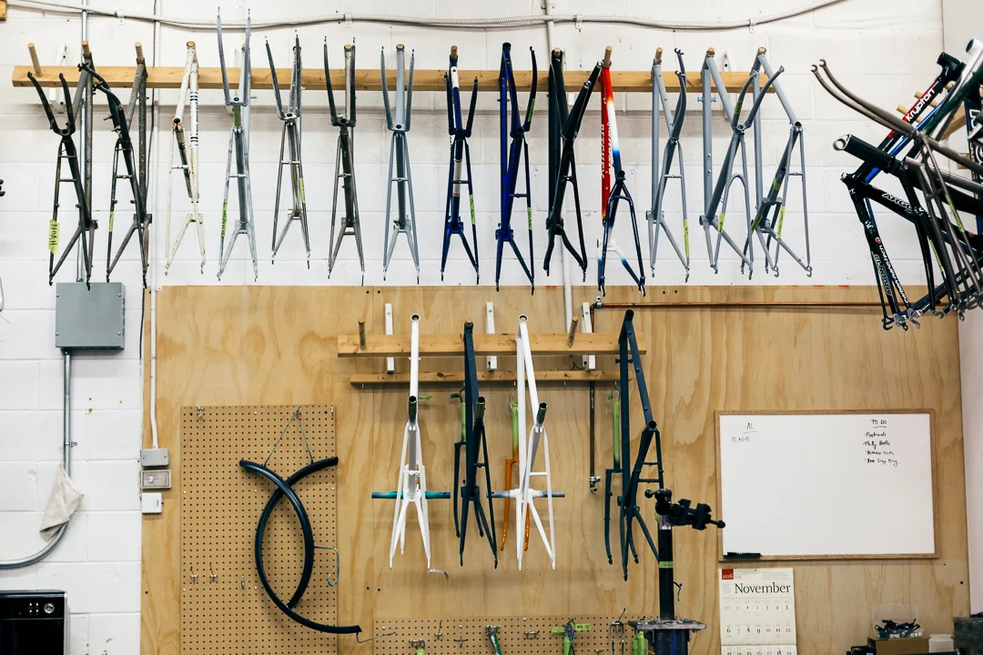
Frames of different preparedness line the VeloColour queue
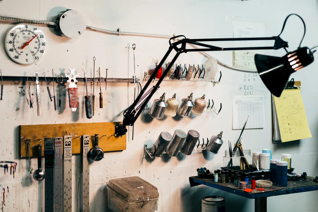
The paint prep room at VeloColour
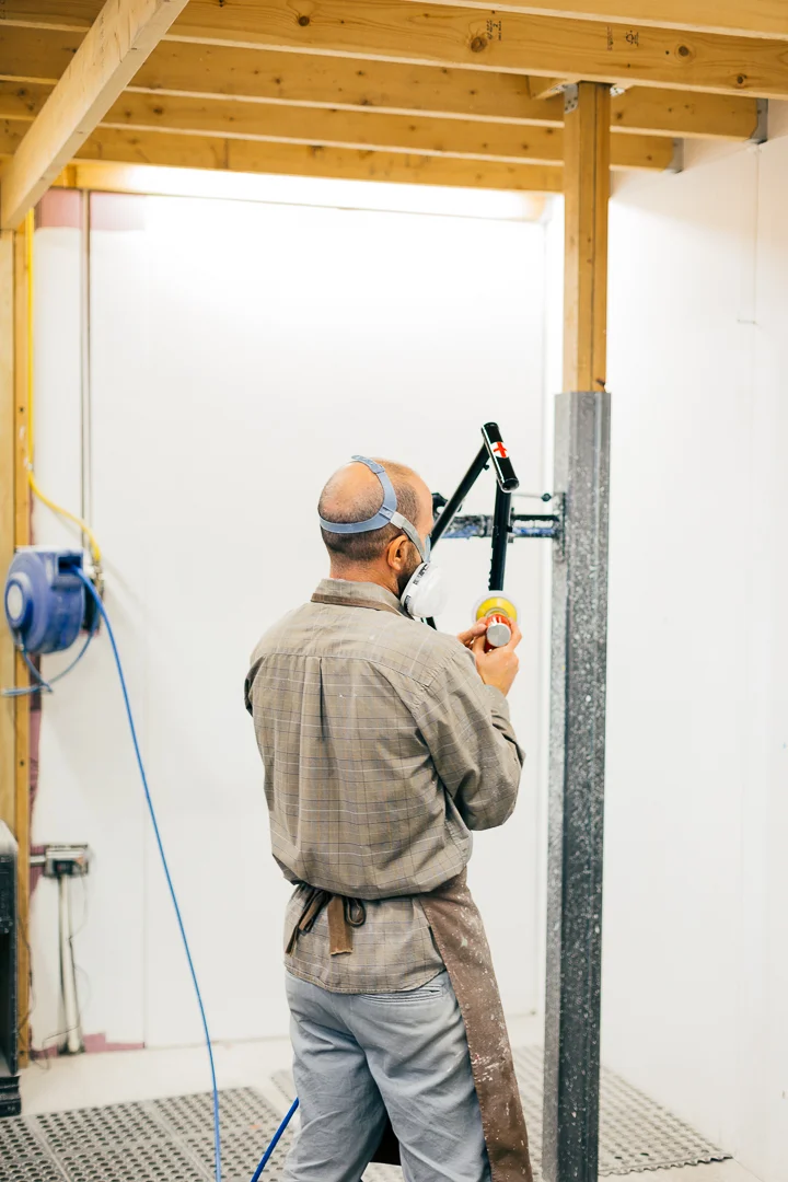
Noah Rosen sands the frames and parts between coats of paint.
Deciding on who to ask to paint this project was the easy part. Truth be told, there really was only ever one choice. It had to be local heroes, VeloColour. About a year ago they helped me by custom painting spokes for my wife's new wheels. It was their small touch that made whole project so special. I knew with 100% certainty that they were the right partner and so when I heard that they were in for our Perfect Project, I was ecstatic to say the least.
Resources: Project Pink
But who are VeloColour? If you've even casually watched what is going on in custom bike painting, then the name VeloColour will be of no surprise. Founder and painter, Noah Rosen, officially opened their doors in 2008 after first putting paint to frames a few years earlier. In the near decade since, Noah and his partner Suzanne Carlsen (joining in 2014) have put their creative mark on some of the rarest and most beautiful frames in the world.
How good are VeloColour? Well, only a year after opening their doors, VeloColour won 'best paint' at the 2009 North American Handbuilt Bike Show. And then when the Pope came to visit Philadelphia in 2015, VeloColour got the call to paint "The Popecyle." Enough said?
Inspiration
While the idea of building a forever bike has been in my head for as long as I can remember, I've never had a clear image of what it would look like. I actively keep images and scraps as inspirations for my photography which is an old habit that I use to keep myself motivated. When I started to think about painting my own bike I instinctively dove into the inspiration folders. Honestly, that was my first and biggest mistake. I attribute all of my uncertainty to that action. Unfortunately, and incorrectly, I was looking outside in for an idea that really should be a reflection of the inside out. I was never going to find what I was looking for, and if I ever thought I had, I would have been wrong.
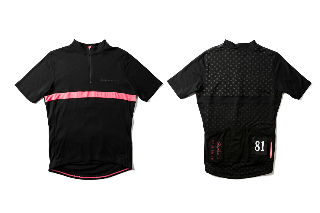
The Rapha + Paul Smith Maglia Nera Jersey
While trying to pass the time on that previously mentioned sleepless night, I started doing some introspection. What were some of the things I loved the most? I made a mental list before sorting them out and then connecting the dots. A few things that worked their way to the top were;
- Favourite race, the Giro D'Italia.
- Favourite piece of Giro history; the Maglia Nera jersey.
- Favourite designer; Paul Smith (who also happened to design my favourite Maglia Nera).
- Favourite colour; pink.
Shouldn't my bike represent my favourite race, jersey, colour, and details of my favourite designer? Yes, yes it should. Now we had something to work with.
Resources: Paul Smith x Rapha Maglia Nera Jersey
The Design
Using the Paul Smith designed Maglia Nera jersey as a design influence was pretty straight forward. There is a lot about the jersey that I love but there are a few particular details in which I drew upon.
The combination of predominantly black with pink accents (although currently very trendy) just works so well. In terms of patterns and texture, maybe the most important detail is the back of the jersey. It has a very subtle tone on tone polka dot print in reflective ink. These were the elements I wanted to bring forward into my own interpretation. The colour palette was set with flat black and Giro D'Italia pink with tone on tone graphic treatments. Here's what I came up with.
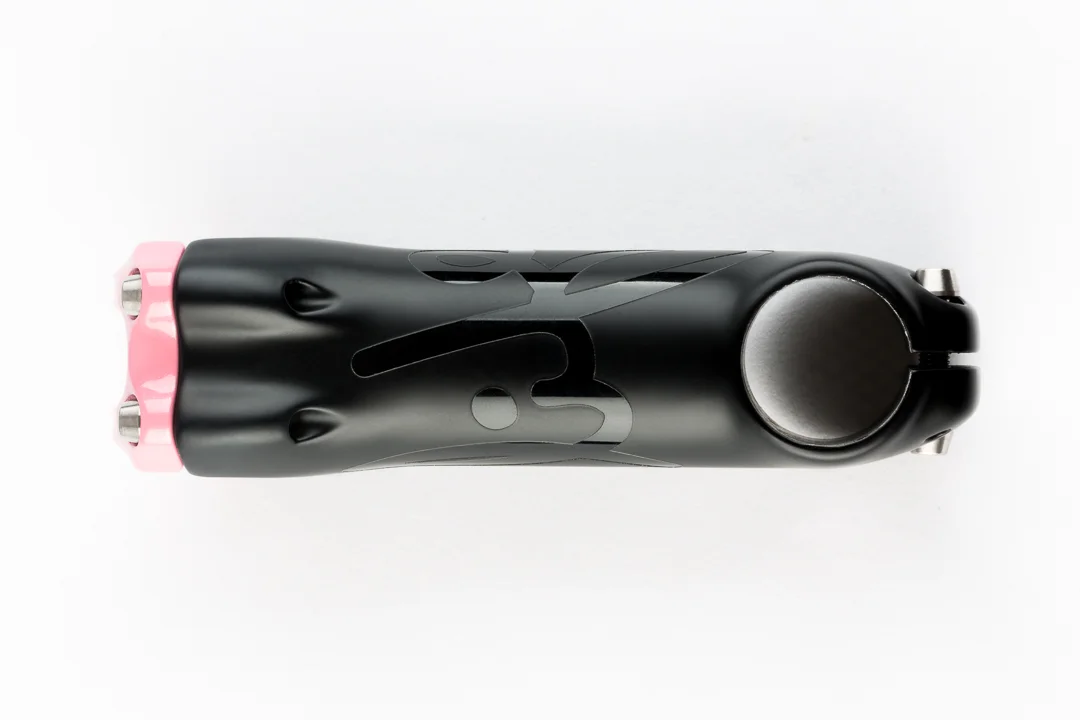
Matte black and pearl pink ENVE stem with a gloss 'Life' logo.
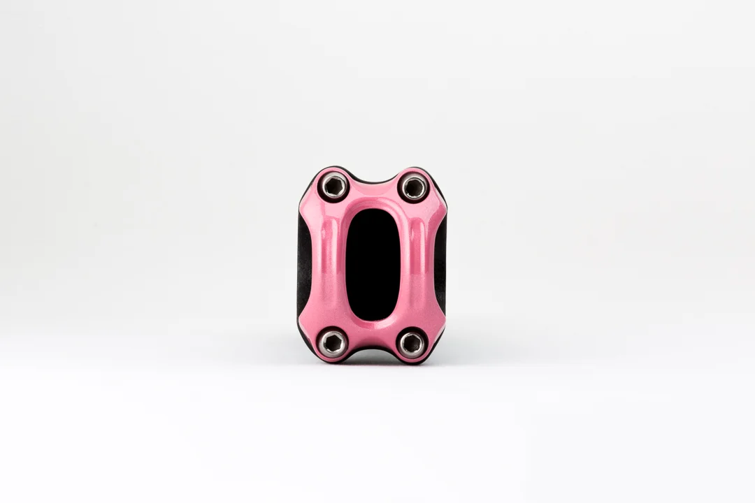
Pearl pink faceplate on the ENVE stem for my forever bike
Stem
The stem is inspired by the front of the Maglia Nera jersey. It is predominantly matte black with a swath of pink via the gloss painted face plate. As a special request I asked that my "Life" logo be wrapped around the body of the stem in high gloss black for a tone on tone appearance. Every time I ride I’ll be reminded about what matters most. Enjoying life.
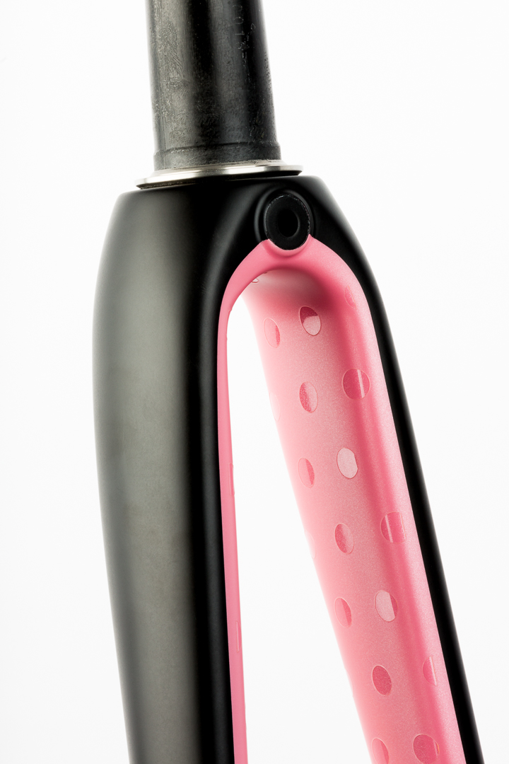
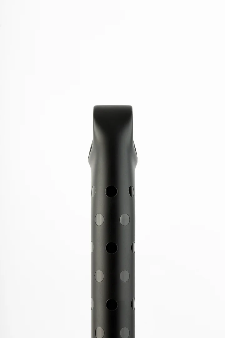
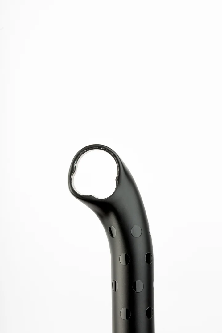
Matte black exterior and pearl Giro pink with gloss polka dot lined interior on the ENVE 2.0 fork
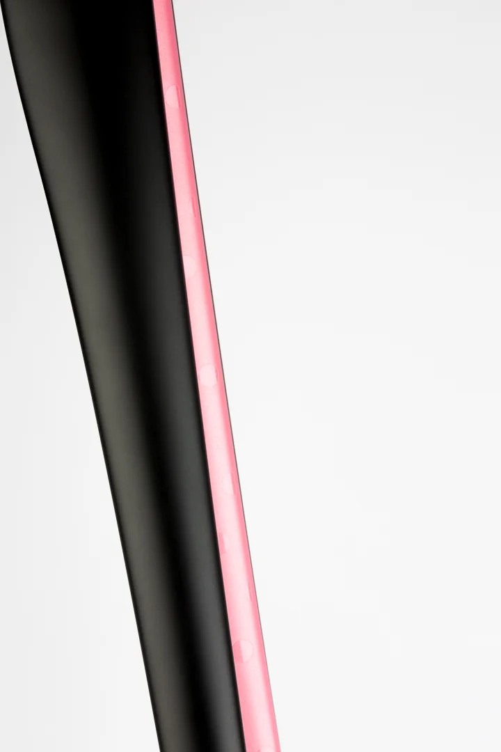
Matte black and pearl Giro pink interior painted fork.

Matte black all the way to the tips.
Fork
Besides the frame itself, the fork is the most available real estate. Much of my attention was spent on how I wanted the fork painted. Since the predominant colour is black, I asked for matte black on the exterior and to line the interior with pink. But the fork still needed some style. So I took inspiration from the Maglia Nera jersey once again.
The inside of the fork features high gloss polka dots for more of the tone on tone detailing. When I went into see VeloColour to pick the right pink (more on that below), they suggested that we add some pearl flake to the pink to really make it pop. Reminder again, trust your partner and have some faith. As you can see, they nailed it!
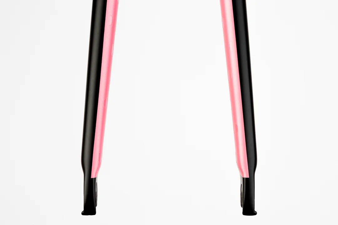
Front view of the matte black exterior and pearl Giro pink interior on the custom painted ENVE 2.0 fork
Seatpost
Not originally in my design scheme, Mike from Blacksmith Cycle convinced me that I shouldn't overlook the seatpost as part of the canvas. After recognizing how the painted seatpost on his pink Parlee brings it all together I knew his advice was sound.
My first inclination was to paint the post matte black with pink polka dots, but when I presented the idea to my wife (and key advisor), she asked why I would introduce a contrasting colour pattern there? I hate when she is right. So to tie it all together, I stuck with the polka dot print to match the fork but I kept it to high gloss black for more tone on tone subtlety.
When I look at it now I can't believe I was ever not going to paint the seatpost. What was I thinking? It just glues it all together by connecting polka dots with the fork and tone on tone gloss black with the stem. Perfect.
Matte black with gloss black polka dots on an ENVE setback seatpost - front view
Matte black with gloss black polka dots on an ENVE setback seatpost - side view
Pinking Pinks
Since VeloColour is local to Toronto, they suggested that I come in to meet with them and pick final colours in person. It’s their preference and as I learned in the end, it’s for good reason. Over the course of about 30 minutes we covered a lot of ground. Noah and Suzanne helped me make really critical detail choices that ultimately make this design work. Here is some of how that went.
To match and blend with the frame, Suzanne suggested we go with a slight gloss to our matte black. Think of this as more of an eggshell finish. It works perfectly with the dull sheen in the brushed titanium frame. Rather than going with a punchy and vibrant pink, we went with a traditional Giro pink. This shade is much closer to a classic soft pink with they matched to a Giro D'Italia Maglia Rosa jersey that I left with them. It's timeliness, classic, and ultimately correct.
Towards the end of the consultation Noah came out from the sanding room to weigh in on the pink and gloss finishes. Together Noah and Suzanne suggested we pearl the pink rather to help catch and reflect light inside the fork. Defying convention, Noah suggested that the gloss treatments actually be masked below the matte finish to give it some depth. This has become one little detail I can't get enough of.
The colour and finish samples at VeloColour
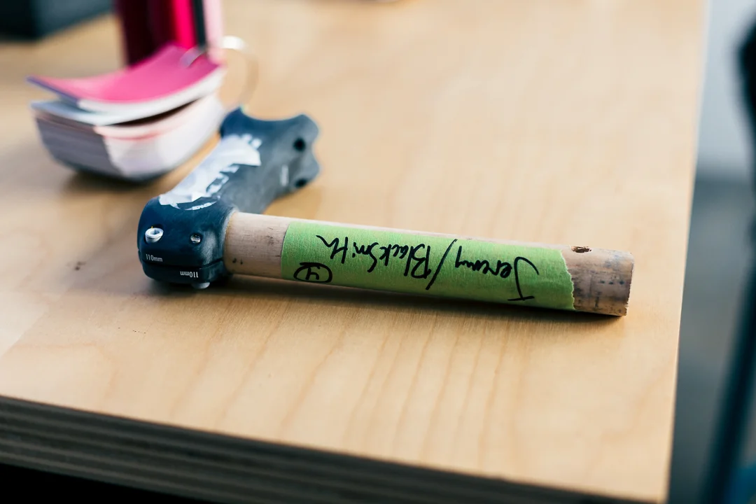
Parts are sanded, prepped, and marked for paint at VeloColour
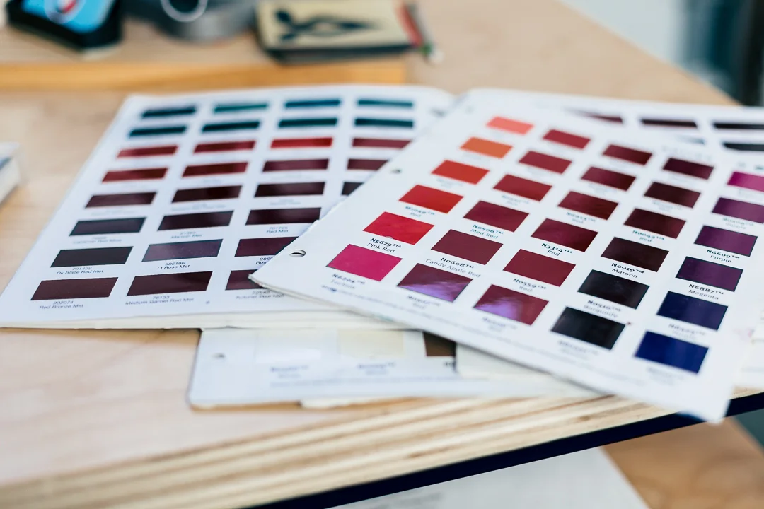
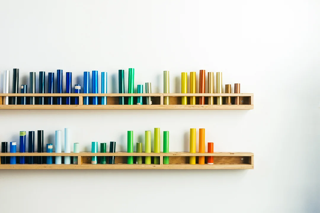
Paint swatches offer limitless choices for custom paint at VeloColour
Final Delivery
After leaving the VeloColour shop I felt an elevated sense of excitement and anticipation. The whole project was taking another big leap forward. The design was done, the colours were picked, and we had a spot in the queue. It was beginning to feel like #newbikeday would be here soon. All that was left to do was patiently wait.
If asked what has been my favourite part of this whole process, I'd have a hard time choosing. It’s all been so amazing but I underestimated how personal the experience of paint design would be. It took a bike that was made for me and turned it into a bike that is me. Working with incredible partners in Blacksmith Cycle and VeloColour made it enjoyable and stress free.
What I've learned from this experience is that paint is a critical part of a custom bike and if the opportunity is there, I'd recommend it to anyone and everyone.


